Google Redesigns The Play Store for Wear OS – It’s Slightly Better Now
It’s been a while since the American tech giant Google revealed its Wear OS. Multiple significant issues were reported in the new operating system, and it got a thumb down reviews from the critics’ community. The firm pushed several updates to improve the operating system, and the Wear OS slightly enhanced in the process. Though there are several improvements over time, the result was far less than expected.
Recently, the firm took a major step to revive the Wear OS. Google recently redesigned the entire Play Store for Wear Operating System. The redesign contains some new tweaks. Google is most likely rolling out the Play Store update for all the users. Initially, people might find it average at best, as the redesign is quite similar to the previous one, and there are no radical changes made by Google. But the redesign has a lot to offer.
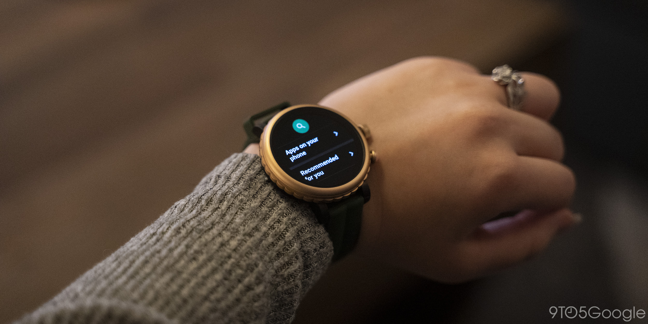
Image Credit: 9to5 Google
Redesign in Details
The first and most significant change is related to the menu indicator. Initially, the positioning of the menu indicator covered the search option, and people find it annoying while using the application. Google finally ditched the menu indicator from its position in the new redesign process. As a result, users now can experience a smooth experience while using the watch.
Now the menu icon shifted to the main screen of the application. There are three new buttons, such as Accounts, My App, and Setting are available at the bottom. Some users claimed that the more original version has a relatively darker background, but it is tough to notice the difference. You can only experience the change if you put the two devices side by side. Apart from these changes, there are minimal changes in the Wear OS. Basic features like App listing are unchanged. Though the redesign offers a lot, experts think there is a lot to do, if Google wants to compete with industry leader Apple.


